Building RFlect: turning raw chamber data into publication-quality antenna plots
Every antenna measurement campaign ends the same way: a pile of exported data from a chamber or a network analyzer, and a deadline to turn it into something a human can actually read. For years my answer was a folder of one-off scripts — a little Matplotlib here, a TRP calculation there, copy-pasted and tweaked per project until nobody could remember which version was correct.
RFlect is the tool I built to stop doing that.
The problem with one-off scripts
Antenna characterization produces a lot of numbers that mean nothing until they’re reduced and plotted: gain versus angle, 2D and 3D radiation patterns, efficiency, total radiated power. The math isn’t hard — but doing it consistently, across builds and across measurement systems, is where ad-hoc scripts fall apart. Two problems compound:
- Inconsistency. Slightly different scripts produce slightly different plots, and suddenly results from January aren’t comparable to results from March.
- Friction. Re-deriving the same figures for every report is exactly the kind of repetitive work that drains time from the actual engineering.
I wanted one tool that ingests the raw exports, applies the same math every time, and produces figures that are ready to drop into a report or a datasheet.
What the output looks like
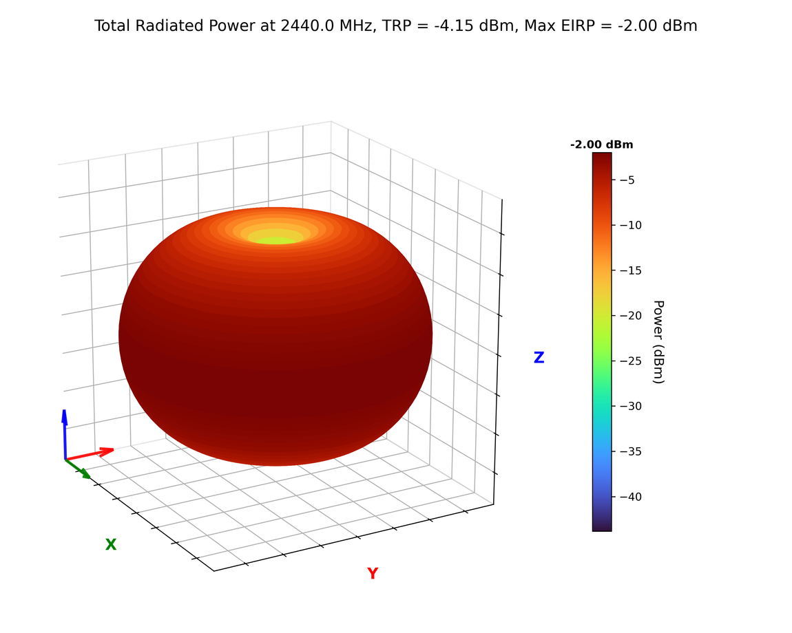
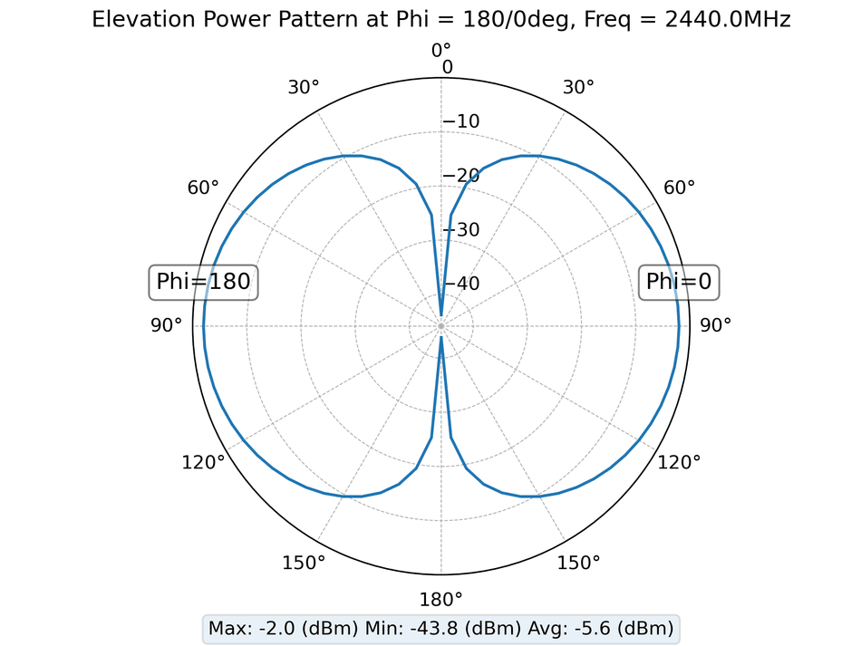
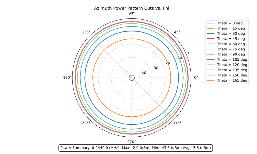
RFlect reads measurement files from antenna chamber systems and network analyzers and renders the standard deliverables of antenna characterization. The plots below are RFlect’s actual output for a synthetic half-wave-dipole reference — a textbook pattern everyone recognizes — so you can see the standard views on familiar data:
Passive scans get the same treatment. Here’s efficiency, gain, and directivity vs. frequency — for a separate antenna this time, swept across several ground-plane spacings:
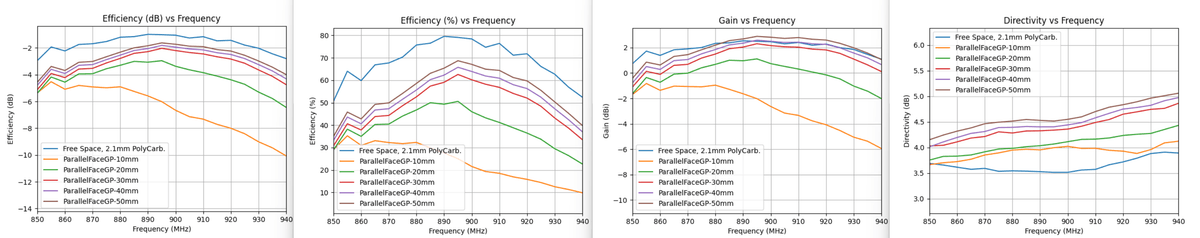
That last one is the kind of plot I reach for constantly: the same antenna characterized against different ground-plane spacings, so you can see how integration changes performance rather than arguing about it.
Design decisions
A GUI, not a notebook. Plenty of RF engineers aren’t full-time Python developers, and they shouldn’t have to be to look at a radiation pattern. A GUI lowers the barrier — load a file, see the plot.
Standalone executable. RFlect is packaged with PyInstaller so it runs without a Python environment. “Install Python, create a venv, pip install these ten packages” is a non-starter for a colleague who just wants to see a plot, so shipping a single double-clickable app removes that wall entirely.
A deterministic core. All the analysis math lives in pure functions — pattern math, efficiency, TRP, axial ratio, S-parameters. The GUI and, later, the MCP server are both thin shells over that same core, so a number is computed exactly one way no matter how you ask for it.
The stack
- Python — the glue and the math
- NumPy — pattern math, efficiency, TRP
- Matplotlib — 2D/3D plotting
- PyQt5 — the desktop GUI
- PyInstaller — standalone packaging
RFlect today: a 41-tool MCP server
The newest chapter is the one I’m most excited about. As of v5.0.0, RFlect ships a Model Context Protocol server with 41 tools, so the entire analysis core is drivable by an AI assistant like Claude Code. You can point it at a folder of measurements and say “process these and write me a report,” and it will. (My copper-mountain-vna-mcp server does the same thing for a VNA.)
A deliberate design choice: RFlect is zero-dependency by design. It makes no outbound LLM or API calls and needs no API key. It’s a deterministic RF-analysis-and-rendering toolkit — when it’s driven over MCP, the agent is the LLM. RFlect computes the data and renders the plots; the agent supplies any natural-language narrative. Report prose is data-driven by default, or authored by the agent and passed in.
The 41 tools fall into nine categories:
| Category | Tools | Examples |
|---|---|---|
| Import | 6 | import_passive_pair, import_antenna_folder |
| Analysis | 5 | analyze_pattern, compare_polarizations, get_gain_statistics |
| RF Analysis | 6 | analyze_s11, analyze_group_delay, estimate_link_budget, analyze_mimo_diversity |
| Calibration Drift | 8 | cal_drift_ingest, cal_drift_compare, cal_drift_report |
| Bulk | 5 | bulk_process_passive, bulk_process_active, convert_to_cst |
| UWB | 3 | analyze_uwb_channel, calculate_sff_from_files |
| Reports | 3 | generate_report, preview_report, get_report_options |
| Orchestration | 1 | process_folder |
| Validation | 1 | analyze_iperf_angle_sweep |
The report tool is where the deterministic-core / agent-narrative split pays off:
generate_report produces a branded DOCX with a cover page, gain tables, and embedded
2D/3D plots from the measurement data alone — no LLM required. But the driving agent
can override the executive summary, per-measurement analysis, recommendations, and
figure captions by passing its own prose. The numbers stay trustworthy; the writing gets
better.
This is the AI-assisted RF workflow I keep talking about, made concrete: the repetitive parts — load, analyze, plot, format — are tools an assistant can orchestrate, and the engineer stays focused on what the data means.
A note on portability
RFlect grew up around the specific equipment I work with. It parses the Howland chamber’s
WTL .txt exports (formats V5.02 / V5.03), Copper Mountain VNA CSVs, and standard 2-port
Touchstone files — and the dipole plots above were produced by feeding RFlect a synthetic
dipole dataset in exactly that WTL format. The analysis and plotting are general, but if
your chamber or VNA writes a different format, you’ll likely need to adapt the file
parsers (plot_antenna/file_utils.py) to your exports first. It’s open source precisely
so that’s straightforward — and a good first contribution if you want one.
Why open source
RF tooling is full of expensive, closed, vendor-locked software. A lot of the day-to-day work — visualizing a pattern, sanity-checking efficiency — doesn’t need any of that. Open-sourcing RFlect means other engineers can use it, see exactly how the numbers are derived, and extend it for their own chambers and formats.
If you work with antenna measurement data, give it a try — and if you find a rough edge, issues and pull requests are welcome.